
For the second week of the Under the Covers feature, I’ve decided to bend the rules to the utmost and write about the whole family of books that is the Gallimard Blanche imprint. And the reason that I am being allowed to cover all 7333 titles printed between 1911 and today? Because, aside from some rather serious lapses of judgement, they are all the same.
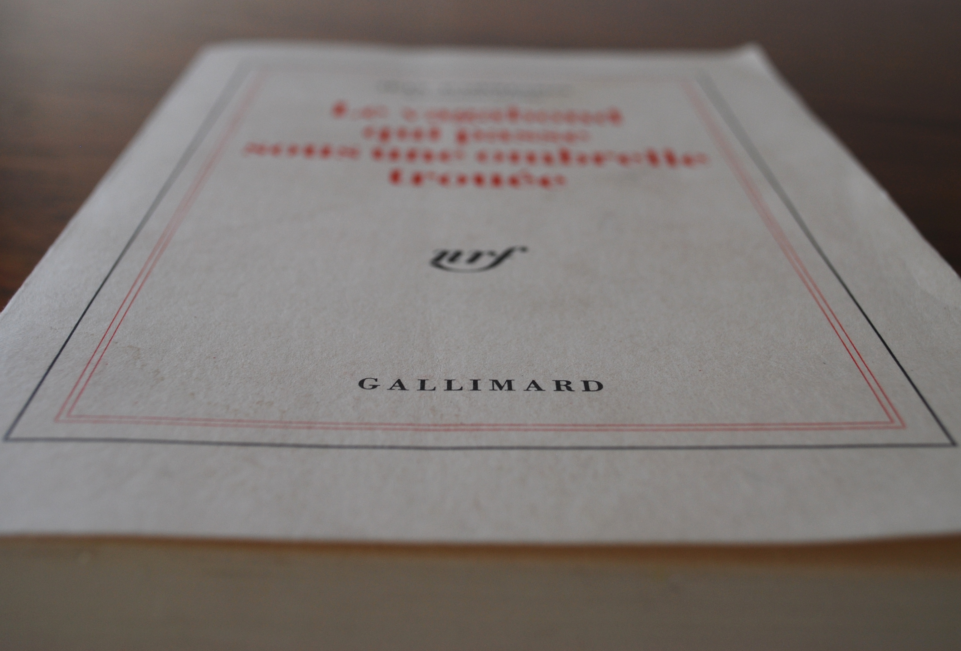 I’ll probably be putting at least one shiny web image of a Gallimard Blanche title below, but in the mean time you will have to do with a rather grubby copy I picked up from a market in Paris a couple of years ago, simply because the title is brilliant. This is Le vagabond qui passe sous une ombrelle trouée by Jean Bruno Wladimir François de Paule Le Fèvre d’Ormesson, which is almost irrelevant except for the fact that this book would look almost identical if it was Look by Romain Villet. And I think this is pretty interesting.
 Now, I can hear you doing a little snort and saying, ‘Why didn’t you just do the Penguin Classics range?’ and that is a perfectly fair point, if a little Anglo-centric, but I would have to reply that everyone features and knows about Penguin Classics. They are seen as oh-so-unique-and-remarkable, but Gallimarde had been doing exactly this for twenty-four years before a Penguin Classic ever hit the shelves priced to compete with a pack of cigarettes. I am not suggesting here that Penguin got the idea from Gallimard – that would be pure supposition, but isn’t it interesting that what I would say are the two best known publishers of their respective languages in the world started out in the early twentieth century with the same idea about how books should be designed and presented?
 There is something in this aesthetic that draws me in, that makes me want to know what it is about the novel that made it too good to need to be sold visually. I also get all flustered at the thought of how beautiful my bookshelves would look if only I owned them all. That would be order in the chaos of my life. I also love that these titles take on a patina of their many readings. The covers are porous and stain easily, pick up dirt and oils from your hands, and slowly yellow and smudge. The state of a Gallimard Blanche is a sure indicator of how loved the text is, and that in itself is a book cover wholly remarkable.
As a publisher, I find the gall and the bravery of deciding to do this astonishing. We are always told how cover design sells books, how it catches the eye of the browser both in the bookshop or online, and yet these two publishers have achieved unequaled levels of fame from doing exactly the opposite of this. It could be argued that this is connected also to the rise of Apple as producer of all beautiful electronics (disputed). In which case, shouldn’t we just do it?
 One reason why we won’t is that we have a fantastic collection of designers in the office, who are getting their feet in the world of book design and are creating ever more fantastic designs, and we want to nurture this rare chance for them to be truly creative and to see what may come of it. Also we look at the likes of Canongate, who consistently deliver on design and are always looking at ways to change the nature of the book-as-artefact, and we would not have access to that ability to express a flash of both the book’s emotion, and also of our (Freight Books and Freight Design) personality.
I love these books; I cherish them for their simplicity and praise them for their boldness and never want them to change, but as we will be showing you over the coming weeks cover design, when done well, creates siren-covers that sing to you. Covers that, now you have touched them and seen them up close, there is no way you will leave the bookshop without them.
For a potted history of Gallimard press and their extraordinary beginnings, I refer you to this short piece by the Guardian.

I’ve always loved Gallimard without ever understanding why and that is from someone who could barely read a word of what actually lies within. Perhaps it is to do with trust – if a publisher has the confidence to find one brilliant design and stick with it perhaps they are concentrating hard on what IS within. And I don’t mean to undermine you own lovely designers by that…..
Hi Linda,
Thanks for your comment! I quite agree – there is a pushing to the front of the content in their singular design. I think the designers agree, too! But a good book cover, one that doesn’t upstage but instead offers a window into the words, blows all of this out the water. A rare occurrence though.